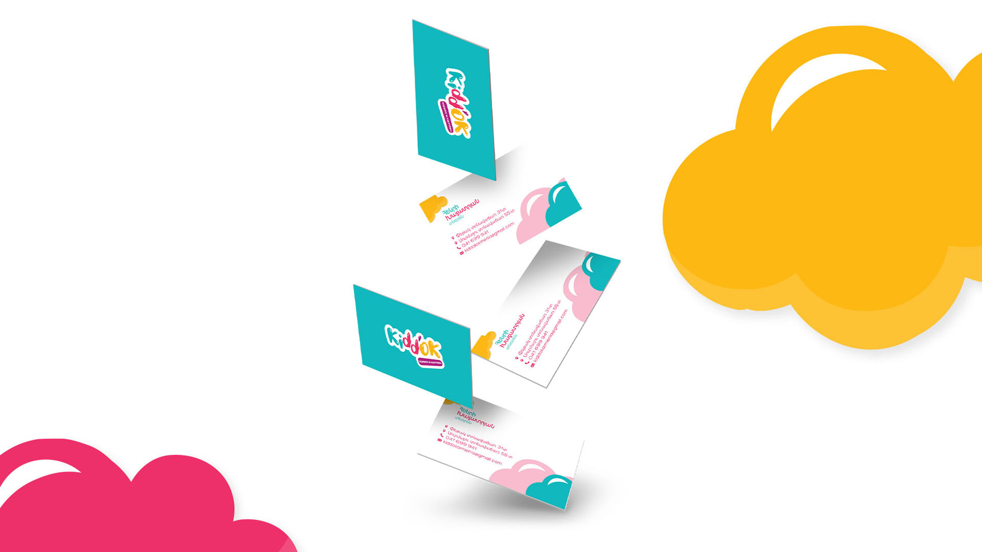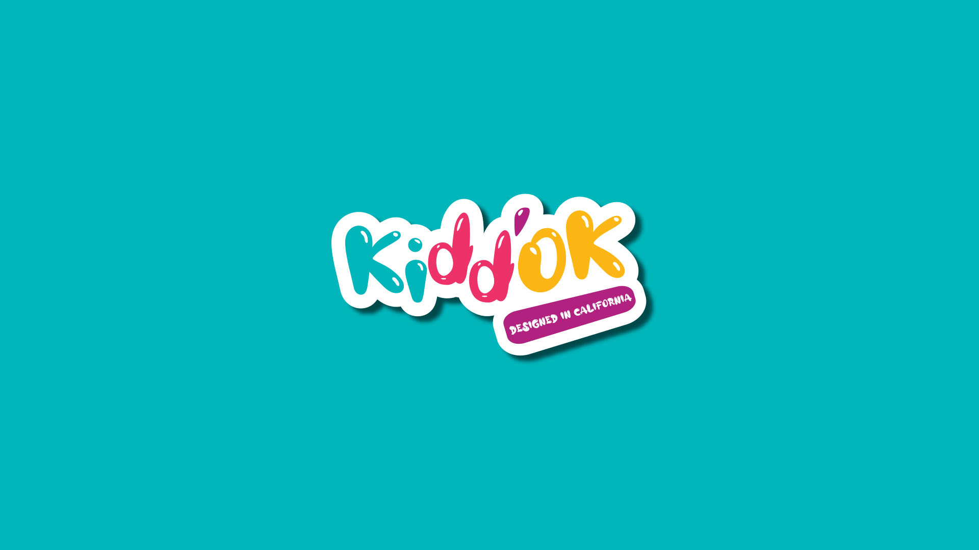
Kiddok is a toy brand specialized in designing and producing toys and accessories for kids and teenagers. We are sure that the brand and its products will be loved by kids and their parents in a short period of time. The name “Kiddok” consists of "kiddo" and "ok" words. The word kiddo is a synonym of a child to which we added "ok" and as a result, we got a funny and easy-to-remember name. The name also conveys kids-related emotions. We chose vibrant colors for the brand so that its visual representation is attractive to children. As the products of Kiddok are intended for kids, we used the “Alloy Ink” font which has a low melting look and can be associated with kids’ favorite sweets such as ice-creams, donuts and chocolates.