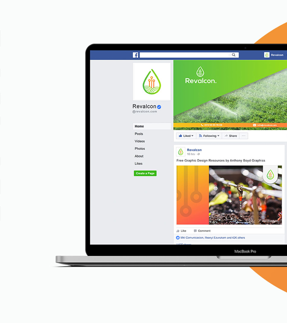
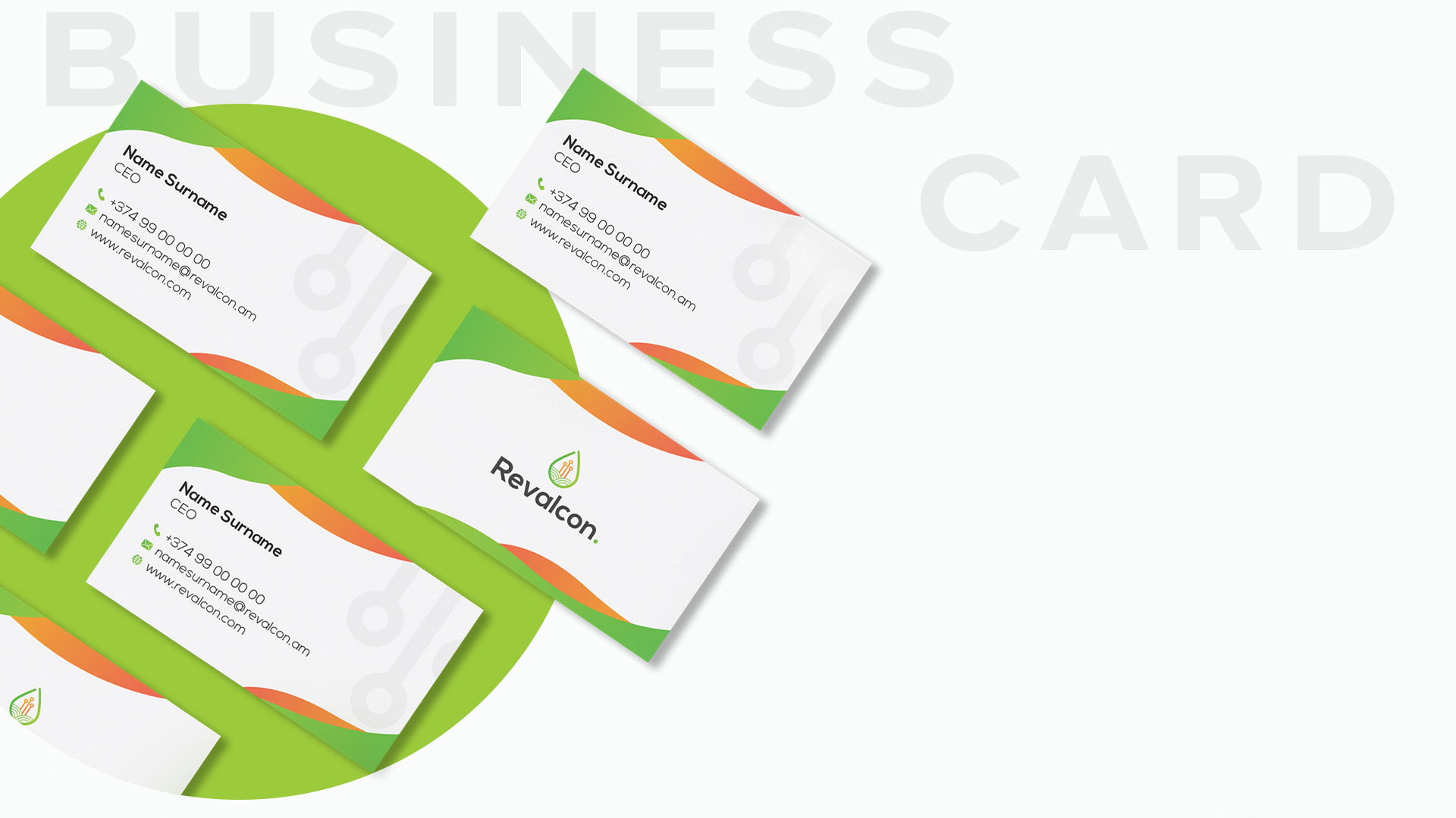
The future of farming - technology which makes farmers' lives better. Revalcon is a new kind of technology that allows the processing of the entire irrigation process through mobile and web applications. The corporate style design of Revalcon includes the design of logo, business card, brochure, presentation and billboard. Inspired by nature and technology, we combined the three elements to make a meaningful yet eye-catching logo. The three lines symbolize the green, endless fields. Technology and vertical lines combined in a water drop, make a great combination, fully reflecting the identity of the company. The two main colors are green and orange. Green is the color of nature, growth, and harmony. Orange symbolizes light in technology and also is a symbol of energy, warmth and vitality.